Election Systems & Software
Designing for change, accounting for the unknown
Team
1 Partner
1 Creative Director
1 Senior Designer (Myself)
Responsibilities
Product Design
Prototyping
Guerilla Usability Testing
Style Guide
Design Systems
Overview
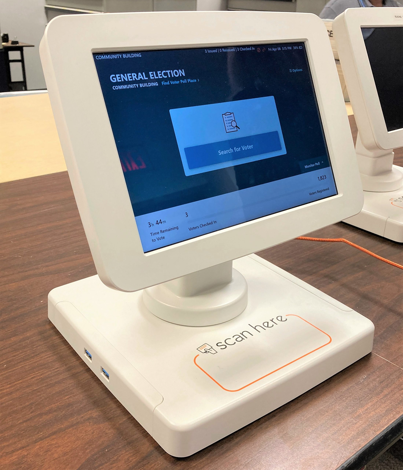
DesignMap worked with ES&S (Election Systems & Software) to redesign an outdated and confusing tablet app. The antiquated tool required poll workers to endure lengthy training.
With a complete application redesign, and set of accessible UX patterns that flex with changing election requirements, the redesign helped ES&S adapt to different client needs and enabled poll workers to jump in with confidence on Election Day.
Application (Before)
Before diving into design, we worked closely with ES&S' product and development teams to first understand what really happens at polling locations on Election Day. With visual models of complex election conditions, we reached a better shared understanding of realistic business needs and possible poll worker scenarios.
In addition to talking to subject matter experts, we interviewed several volunteers who shared their election day experiences with us. Volunteers are motivated and driven to contribute, but when election day rolls around, all the training goes out the window.
Our goal was to help any poll worker feel less overwhelmed on election day, regardless of training or skill level.
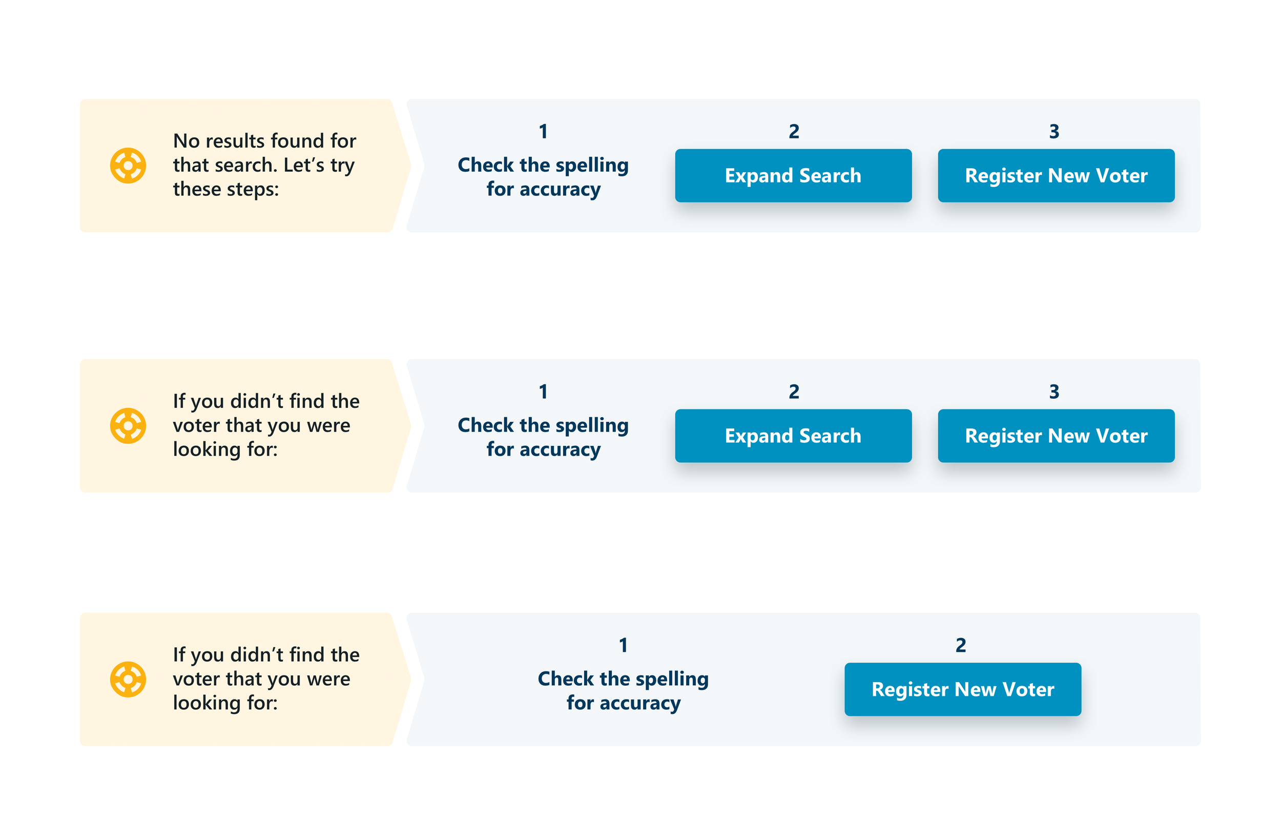
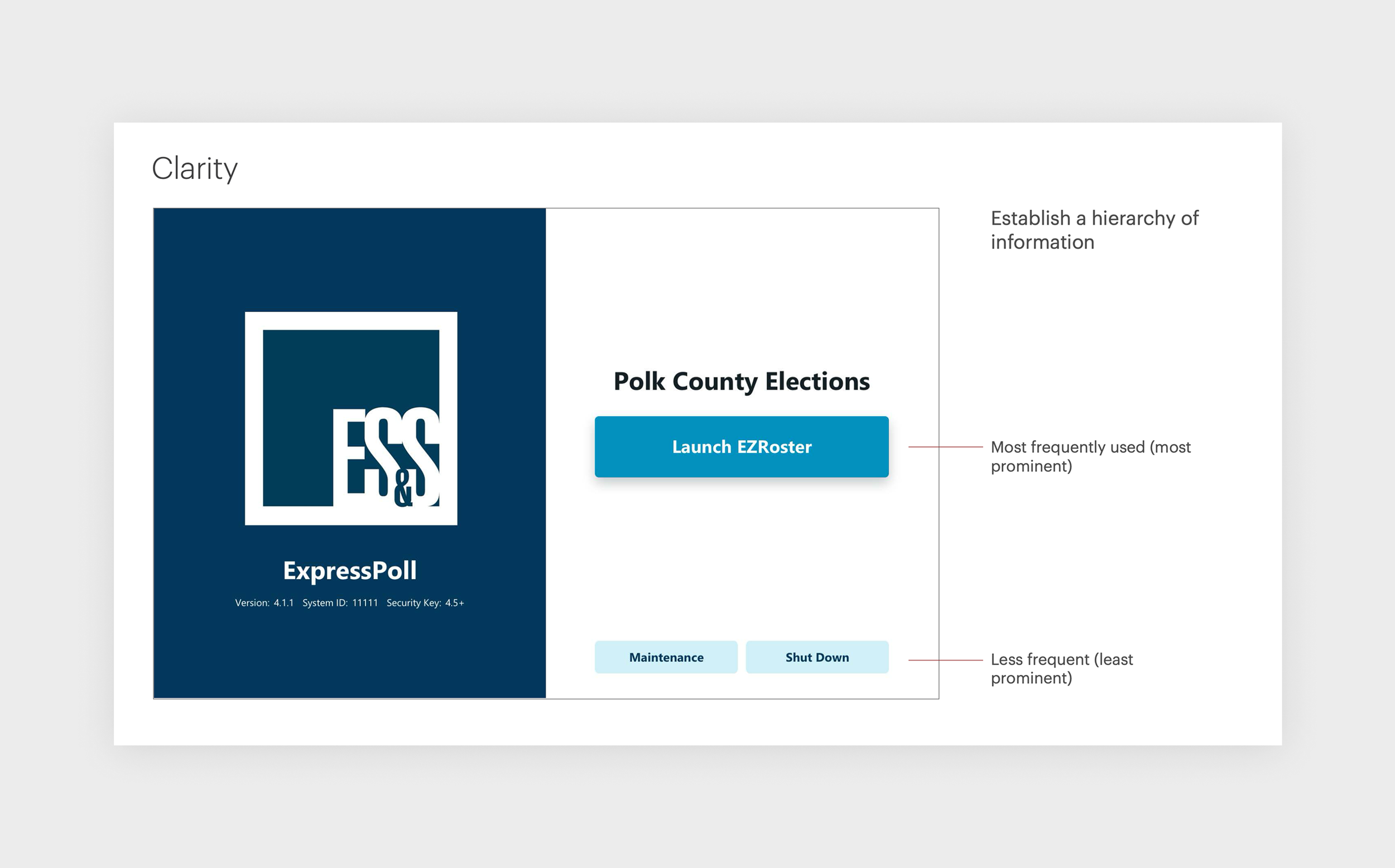
I worked to establish a set of design principles with the team. With guiding principles, we crafted a design system to help guide poll workers to an appropriate solution. By presenting information at the right time and in human-readable terms, we took complicated scenarios and broke them down into more manageable tasks.
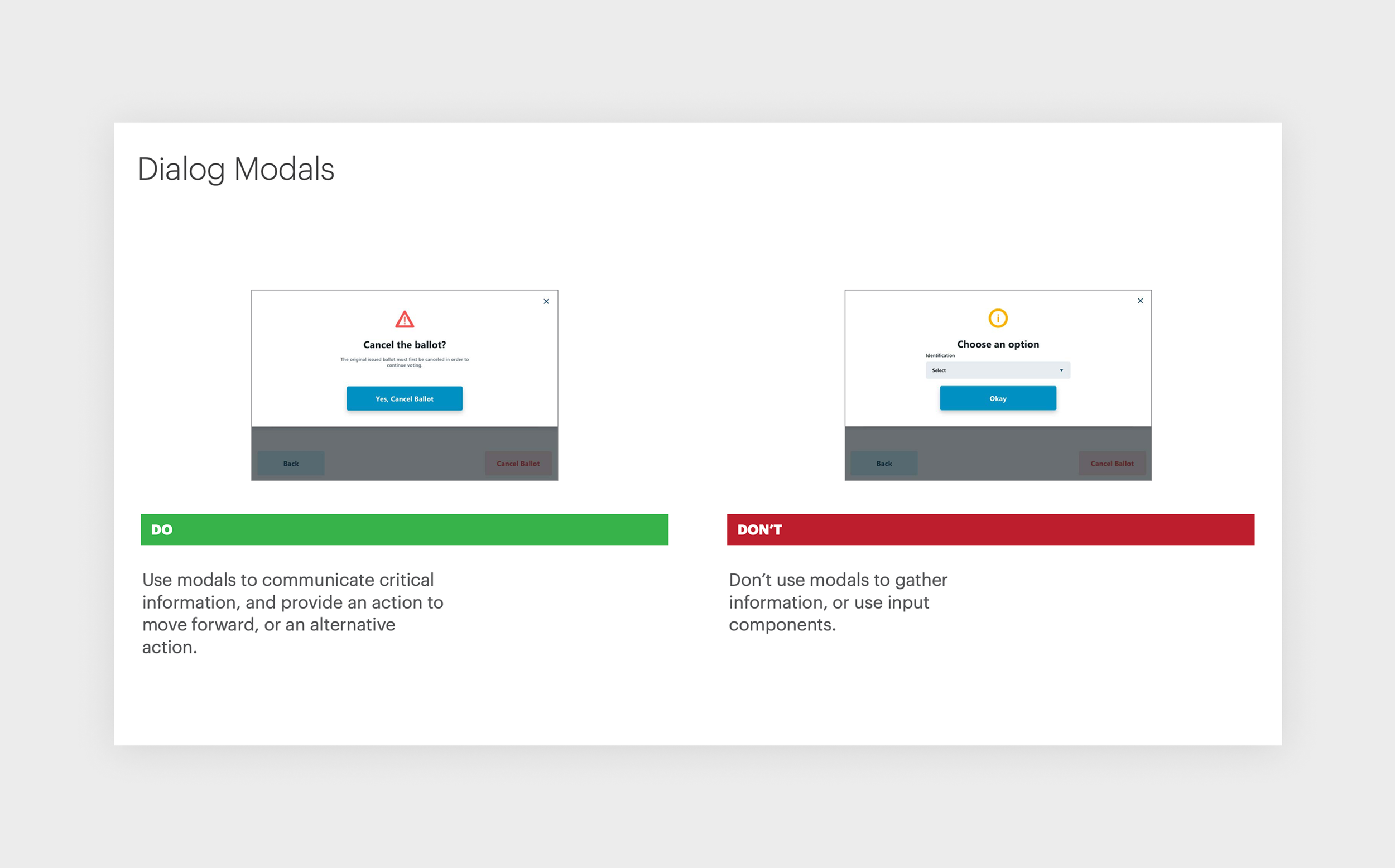
We intentionally created a system of flexible components that are optimized for accessibility and flexibility. ES&S caters to a variety of jurisdictions, and ballot requirements often vary by state, county, and even small towns. If more information gathering was required in Arizona than California, the system of UX patterns was designed to flex and scale without breaking.
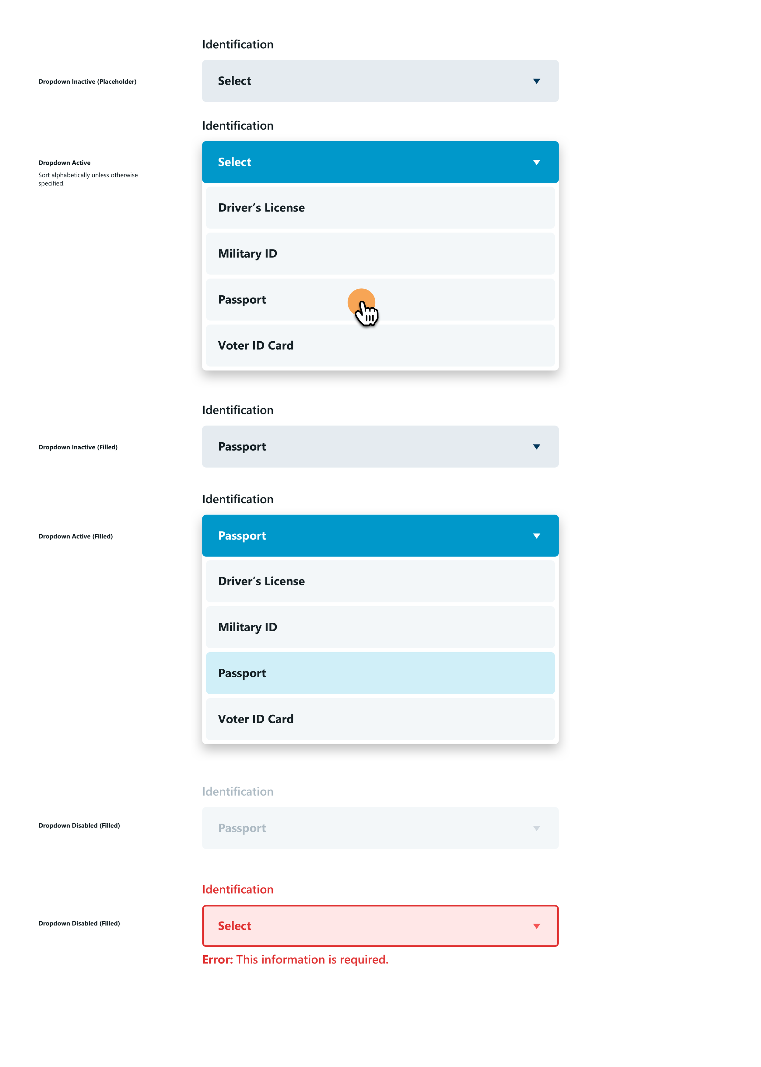
I created a site map to capture high level pages and flows categorized by user type. This helped the team visualize requirements at a high level, and recognize UX patterns that we created.





Learnings
Although usability testing wasn’t accounted for in the original project plan, I felt it was essential to evaluate our team’s proposed designs with real people. I initiated guerrilla usability testing by taking the working prototype to a local coffee shop. In one day, with a few rapid sessions (and a lot of coffee!), we optimized the search field behavior based on our observations. We encouraged the internal team at ES&S to continue evaluation with formal usability testing before launch.


