Proteus
Designing the future of oral oncolytics

Role
Senior Designer
Responsibilities
UX Design
Visual & Interface Design
Persona Workshop & Creation
Context
In 2017, the FDA approved the first-ever “smart pill,” a groundbreaking innovation that combined an ingestible sensor with a wearable patch to track patient adherence and health metrics. The company launched a minimum viable product (MVP) that integrated branding, hardware, marketing, and digital applications designed for both patients and providers. With a focus on achieving market fit for chronic conditions, Proteus hired DesignMap in 2018 to refine and optimize the digital and hardware ecosystem for widespread adoption.
Over the course of 6 weeks, along with one other Senior Designer, I worked directly with the Proteus design team and Director to deliver an end-to-end narrative that visualized the company’s strategic vision to improve health outcomes for cancer patients, and beyond.

The Challenge
Care teams had a lack of visibility into the patient’s actual treatment start date and medication schedule adherence. Proteus would be the single source of truth for tracking the patient’s ingestion of Capecitabine for Colorectal Cancer.

Rapid Persona Archetypes
We leaned heavily on the internal team’s knowledge to understand patient and provider needs, as well as industry research about the oncology space. We used collaborative in-person sessions with the Proteus team to quickly define 7 primary user archetypes that would guide our approach for human-centered experience design.


From Pain Points to Opportunities
To frame our thinking, we started with a script — an end-to-end story with various persona archetypes that highlighted possible “unhappy” paths and key inflection points in the user’s cancer journey. With these pain points identified, we could begin ideation around how Proteus digital experiences might be able to predict or interviene to provide a better experience for oncology patients. Because we were working under a tight timeline, we explored UX concepts via rapid sketching sessions which allowed us to get a wide variety of ideas out quickly.


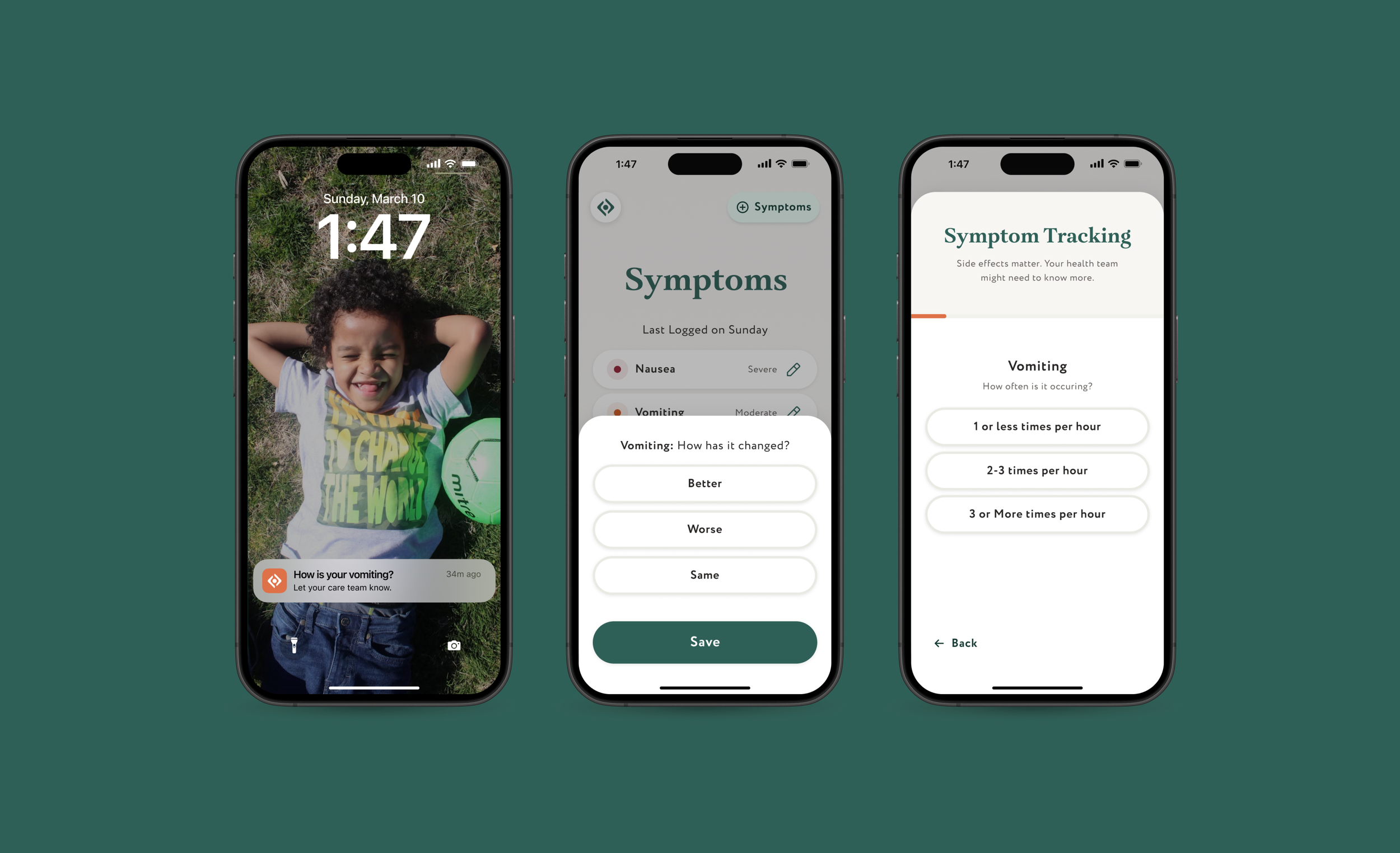
We used detailed wireframes to synthesize our concepts and establish interaction patterns that best suited our key personas. For the patient mobile app, we didn’t want symptom logging to feel like a chore — we wanted to gather symptom data in a way that felt streamlined, efficient, and effortless. We designed an interaction pattern that would auto-advance between brief data captures. Once the symptom data was saved via the mobile app, the app would provide recommended solutions based on severity. The Provider portal would receive the patient-provided information. With Proteus, Providers would have the ability to view patients biometrics in conjunction with adherence, as well as reported symptoms — all in one view. If the symptom was severe enough, the Provider would get an immediate alert.

Visual Design
I was responsible for defining the visual look and feel for the patient mobile app and provider portal. We started with an audit of existing medical applications, to get a sense of the comparative landscape and how we might best position Proteus’ digital presence. We leaned into healthcare companies that were re-imagining the clinical experience with interior design. Rather than sterile and cold hospital rooms, we drew our inspiration from warm and inviting spaces that provided a sense of calm.


Patient & Provider Experiences
We delivered a detailed walkthrough of critical moments in the patient’s cancer treatment journey, focusing on the not-so-happy paths and ways to engage different user types to improve health outcomes.


Outcome
Our designs helped Proteus visualize the next phase of product opportunities for chronic conditions that could improve patient outcomes:
The ability to offer healthcare teams had a more accurate view into each patient’s ongoing treatment, and efficient intervention.
Personalized patient care via mobile app that could help ease the fear of unknowns during treatment.
